Plot ae development of study and sites highlighting at risk sites.
Source:R/simaerep_plot.R
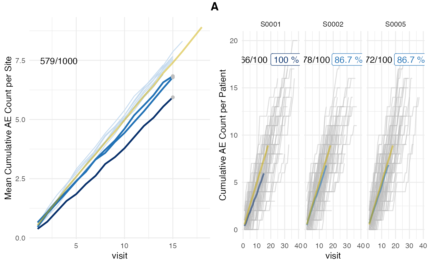
plot_study.RdMost suitable visual representation of the AE under-reporting statistics.
Usage
plot_study(
  df_visit,
  df_site,
  df_eval,
  study,
  n_sites = 16,
  prob_col = "prob",
  event_names = c("ae"),
  plot_event = "ae",
  mult_corr = FALSE,
  delta = TRUE
)
Arguments
- df_visit
dataframe, created by
sim_sites()- df_site
dataframe created by
site_aggr()- df_eval
dataframe created by
eval_sites()- study
study
- n_sites
integer number of most at risk sites, Default: 16
- prob_col
character, denotes probability column, Default: "prob_low_prob_ur"
- event_names
vector, contains the event names, default = "ae"
- plot_event
vector containing the events that should be plotted, default = "ae"
- mult_corr
Logical, multiplicity correction, Default: TRUE
- delta
logical, show delta events on plot
Details
Left panel shows mean AE reporting per site (lightblue and darkblue lines) against mean AE reporting of the entire study (golden line). Single sites are plotted in descending order by AE under-reporting probability on the right panel in which grey lines denote cumulative AE count of single patients. Grey dots in the left panel plot indicate sites that were picked for single plotting. AE under-reporting probability of dark blue lines crossed threshold of 95%. Numbers in the upper left corner indicate the ratio of patients that have been used for the analysis against the total number of patients. Patients that have not been on the study long enough to reach the evaluation point (visit_med75) will be ignored.
Examples
# \donttest{
df_visit <- sim_test_data_study(
  n_pat = 100,
  n_sites = 5,
  ratio_out = 0.4,
  factor_event_rate = 0.6
  ) %>%
  # internal functions require internal column names
  dplyr::rename(
    n_ae = n_event,
    site_number = site_id,
    patnum = patient_id
  )

df_site <- site_aggr(df_visit)

df_sim_sites <- sim_sites(df_site, df_visit, r = 100)

df_eval <- eval_sites(df_sim_sites)

simaerep:::plot_study(df_visit, df_site, df_eval, study = "A")


# }
# }