
Rolling CRM Example
Jiawen Zhu, Daniel Sabanes Bove
02 January 2019
Source:vignettes/rolling-crm.Rmd
rolling-crm.RmdExample 1: Recommend a dose for the next cohort
Setting up the data
library(crmPack)
data <- DataDA(
  x = c(0.1, 0.5, 1.5, 3, 6, 10, 10, 10),
  y = c(0, 0, 1, 1, 0, 0, 1, 0),
  ID = as.integer(1:8),
  cohort = as.integer(c(1, 2, 3, 4, 5, 6, 6, 6)),
  doseGrid =
    c(
      0.1, 0.5, 1.5, 3, 6,
      seq(from = 10, to = 80, by = 2)
    ),
  u = c(42, 30, 15, 5, 20, 25, 30, 60),
  t0 = rep(0, 8),
  Tmax = 60
)

emptydata <- DataDA(
  doseGrid = c(
    0.1, 0.5, 1, 1.5, 3, 6,
    seq(from = 10, to = 80, by = 2)
  ),
  Tmax = 60
)
Structure of the model class
npiece_ <- 10
Tmax_ <- 60

lambda_prior <- function(k) {
  npiece_ / (Tmax_ * (npiece_ - k + 0.5))
}

model <- DALogisticLogNormal(
  mean = c(-0.85, 1),
  cov = matrix(c(1, -0.5, -0.5, 1), nrow = 2),
  ref_dose = 56,
  npiece = npiece_,
  l = as.numeric(t(apply(as.matrix(c(1:npiece_), 1, npiece_), 2, lambda_prior))),
  c_par = 2
)
Obtain the posterior
options <- McmcOptions(
  burnin = 10,
  step = 2,
  samples = 1e2
)

set.seed(94)
samples <- mcmc(data, model, options)
Use ggmcmc to diagnose
library(ggmcmc)
alpha0samples <- get(samples, "alpha0")

print(ggs_traceplot(alpha0samples))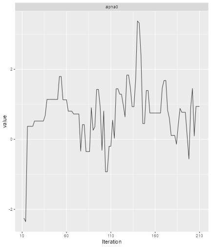
plot of chunk Diagnose-1
print(ggs_autocorrelation(alpha0samples))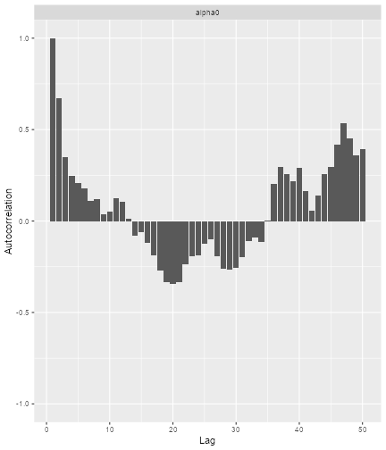
plot of chunk Diagnose-2
Plot the model fit
plot(samples, model, data, hazard = TRUE)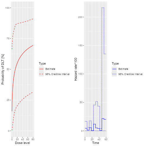
plot of chunk Fit-1
plot(samples, model, data, hazard = FALSE)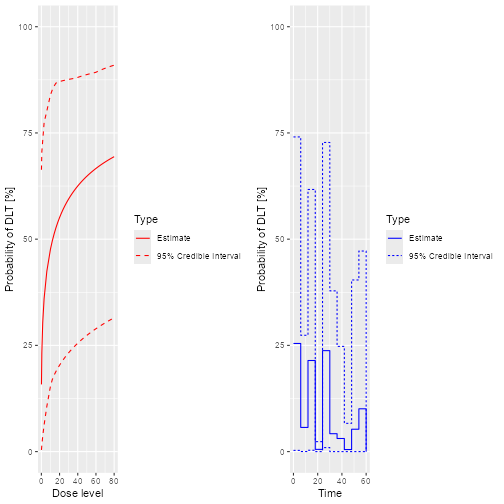
plot of chunk Fit-2
prior mean curve
emptydata <- DataDA(doseGrid = c(
  0.1, 0.5, 1.5, 3, 6,
  seq(from = 10, to = 80, by = 2)
), Tmax = 60)

Priorsamples <- mcmc(emptydata, model, options)

plot(Priorsamples, model, emptydata, hazard = FALSE)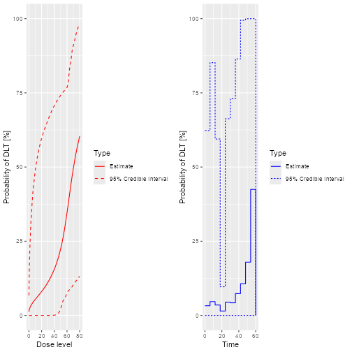
plot of chunk Prior
Escalation rules
Need to fill in (use the same rule in the section 8 of “using the package crmPack: introductory examples”)
myIncrements <- IncrementsRelative(
  intervals = c(0, 20),
  increments = c(1, 0.33)
)

nextMaxDose <- maxDose(myIncrements, data = data)

myNextBest <- NextBestNCRM(
  target = c(0.2, 0.35),
  overdose = c(0.35, 1),
  max_overdose_prob = 0.25
)

mySize1 <- CohortSizeRange(intervals = c(0, 30), cohort_size = c(1, 3))
mySize2 <- CohortSizeDLT(intervals = c(0, 1), cohort_size = c(1, 3))
mySize <- maxSize(mySize1, mySize2)

myStopping1 <- StoppingTargetProb(target = c(0.2, 0.35), prob = 0.5)
myStopping2 <- StoppingMinPatients(nPatients = 50)
myStopping <- (myStopping1 | myStopping2)
Recommended dose for the next cohort
doseRecommendation <- nextBest(myNextBest,
  doselimit = nextMaxDose,
  samples = samples,
  model = model,
  data = data
)

doseRecommendation$plot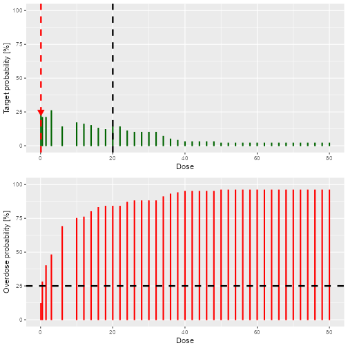
plot of chunk Recommend
doseRecommendation$value
#> [1] 0.1
Example 2: Run a simulation to evaluate operating characteristics
Set up safety window and DADesign to be completed
mysafetywindow <- SafetyWindowConst(c(6, 2), 7, 7)

design <- DADesign(
  model = model,
  increments = myIncrements,
  nextBest = myNextBest,
  stopping = myStopping,
  cohort_size = mySize,
  data = emptydata,
  safetyWindow = mysafetywindow,
  startingDose = 3
)
Set up true curves
myTruth <- probFunction(model, alpha0 = 2, alpha1 = 3)
curve(myTruth(x), from = 0, to = 100, ylim = c(0, 1))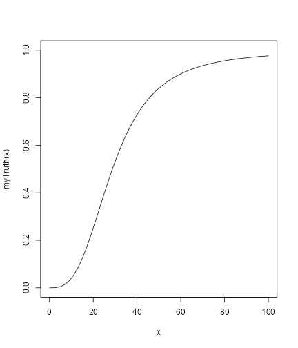
plot of chunk Truth
Perform the simulations
mySims <- simulate(design,
  args = NULL,
  truthTox = myTruth,
  truthSurv = exp_cond.cdf,
  trueTmax = 80,
  nsim = 2,
  seed = 819,
  mcmcOptions = options,
  firstSeparate = TRUE,
  deescalate = FALSE,
  parallel = FALSE
)
Interpret the simulation results
Use a similar way as section 9.2 in the “using the package crmPack: introductory examples” document
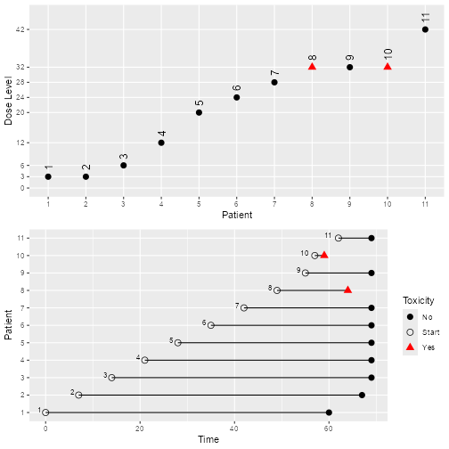
plot of chunk Interpret
mySims@stop_reasons[[2]]
#> [[1]]
#> [1] "Probability for target toxicity is 68 % for dose 34 and thus above the required 50 %"
#>
#> [[2]]
#> [1] "Number of patients is 17 and thus below the prespecified minimum number 50"

# nolint end